10 Best Colour Combinations for a New Home That Look Modern & Elegant
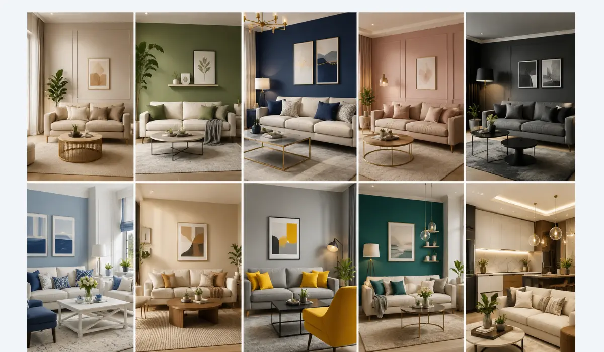
The 10 best colour combinations for a new home in 2026 are sage green with terracotta, butter yellow with aubergine, warm gray with earthy taupe, gray-green with warm red or orange accents, teal with caramel, khaki with putty gray-green, espresso brown with creamy neutrals, dusty blue with warm white, olive green with mustard and burnt orange, and soft pastels layered with warm off-white. Each pairing balances a warm tone against a cool one, which is what actually makes a colour scheme feel elegant instead of random.
Painting a new home is one of those decisions that feels small until you’re standing in an empty room holding four paint swatches, unable to pick. Here’s the thing nobody tells you upfront: the “right” colour combination isn’t really about which shade is trendy this year. It’s about which two or three shades talk to each other well — one grounding the room, one lifting it, and maybe one small accent tying it together. That’s the whole formula behind every combination on this list.
Why Colour Combinations Matter More Than Single Colours
Most people choose paint colour by color first, mood second. Designers do it backwards. A room’s mood — cozy, airy, dramatic, calm — comes from how colours interact with each other and the light in the room, not from a single “pretty” shade on a swatch card.
That’s also why the biggest shift in 2026 isn’t really about which colours are popular. It’s about warmth. Interior colour trends this year are moving away from the flat, cool-gray palettes that dominated the last decade, toward warmer, richer, more grounded tones — earthy greens, warm browns, clay, and mineral shades that feel lived-in rather than showroom-perfect. Keep that shift in mind as you go through this list; almost every combination below leans into it.
Quick Reference: 10 Best Colour Combinations for 2026
| # | Combination | Mood | Best Rooms |
|---|---|---|---|
| 1 | Sage Green + Terracotta | Grounded, natural | Living room, kitchen |
| 2 | Butter Yellow + Aubergine | Warm, regal | Bedroom, dining room |
| 3 | Warm Gray + Taupe | Calm, timeless | Living room, hallway |
| 4 | Gray-Green + Warm Red/Orange | Cool with a twist | Bathroom, kitchen |
| 5 | Teal + Caramel | Sophisticated, cozy | Living room, study |
| 6 | Khaki + Putty Gray-Green | Soft, neutral | Bedroom, dining room |
| 7 | Espresso Brown + Creamy White | Rich, refined | Study, library, den |
| 8 | Dusty Blue + Warm Off-White | Airy, serene | Bedroom, nursery |
| 9 | Olive + Mustard + Burnt Orange | Earthy, energetic | Kitchen, dining room |
| 10 | Pastels + Warm Off-White | Soft, modern | Living room, kids’ room, office |
1. Sage Green + Terracotta
This is the combination designers are talking about most heading into this year, and it’s easy to see why. Sage green brings a calm, natural base, while terracotta adds warmth without ever feeling heavy. Together they hit a sweet spot between cozy and put-together — soft enough to feel restful, but with enough personality that the room doesn’t disappear into the background.
Where to use it: Paint the main walls in sage green and bring terracotta in through an accent wall, ceramics, or a statement piece of furniture. A small pop of light blue in cushions or art keeps the whole palette from feeling too earthy.
2. Butter Yellow + Aubergine
If sage and terracotta is the “safe modern” choice, this is the bold one. Butter yellow has been showing up everywhere from interiors to fashion this year, and pairing it with a deep aubergine (a rich purple-plum) gives it an unexpectedly luxe, almost regal quality.
Where to use it: This combination works best when one colour leads and the other supports — say, butter yellow walls with an aubergine accent wall, headboard, or door. It’s a striking choice for a bedroom or dining room where you want the space to feel a little dramatic without going fully dark.
3. Warm Gray + Taupe
Cool grays dominated interiors for years, but the shift for 2026 is toward warmer, more nuanced neutrals — and warm gray paired with taupe is the most versatile expression of that shift. It’s timeless in a way loud colour trends never quite are, and it pairs beautifully with light wood, stone, and satin metal finishes.
Where to use it: This is the safest combination on the list for buyers who want “elegant” without committing to anything bold — ideal for living rooms, hallways, or open-plan spaces where you want continuity between rooms.
4. Gray-Green + Warm Red or Orange Accents
Gray-green sits right at the intersection of cool and cozy — subtle, grounding, and neutral enough to work with almost any style, but with just enough personality to avoid feeling flat. The trick that makes it feel elegant rather than muted is contrast: bring in furnishings or fixtures with warm undertones, like a red or burnt-orange lighting fixture or sofa, against the gray-green base.
Where to use it: Bathrooms and kitchens benefit especially well from this pairing — gray-green cabinetry or walls with warm brass or copper fixtures reads as sophisticated rather than sterile.
5. Teal + Caramel
Teal bridges blue and green, and depending on how it’s mixed, it can range from moody and dramatic to muted and serene. Paired with warm caramel tones, it becomes a genuinely versatile living room colour — cool enough to feel calming, warm enough to still feel inviting.
Where to use it: Use teal as the dominant wall colour and bring caramel in through wood furniture, leather accents, or textiles. This combination is particularly good in rooms that get a lot of natural light, since teal can read as dark in dim spaces.
6. Khaki + Putty Gray-Green
Khaki has quietly become one of the most requested “ideal neutrals” among designers this year — it reads as brown without heaviness, cream but with more personality. Paired with a putty gray-green trim, it creates a soft, cohesive palette that works especially well alongside rich wood tones and natural materials like limestone.
Where to use it: This combination is ideal for bedrooms and dining rooms where you want warmth and softness without introducing a strong colour statement.
7. Espresso Brown + Creamy White
Deep espresso brown with charcoal undertones has become one of the standout shades for 2026, and it works best paired with creamy whites and neutral, muted earth tones rather than stark white. It’s softer and more livable than the darker mocha and purple-brown palettes that were trending previously.
Where to use it: This combination shines in smaller, cozier spaces — a study, library, or den — where a deeply saturated wall colour can make the room feel like an intentional retreat rather than cramped. Balance it with light, textured neutrals so it doesn’t feel too heavy.
8. Dusty Blue + Warm Off-White
Bright blues are fading out of favour this year, replaced by more muted, dusty, gray-based blues. Paired with a warm off-white rather than a stark white, dusty blue creates an airy, serene feel without tipping into cold or clinical.
Where to use it: Bedrooms and nurseries benefit most from this pairing — it’s calming without feeling babyish, and it ages well as a space’s use changes over time.
9. Olive Green + Mustard + Burnt Orange
For homeowners who want something with real energy, this earthy trio delivers. Olive green, mustard yellow, and burnt orange together create a palette that feels sun-soaked and organic, almost like it’s always belonged in the house. It’s bolder than the other combinations on this list, but it stays grounded because all three tones share the same warm, earthy family.
Where to use it: Kitchens and dining rooms handle this combination particularly well — olive as the base, mustard on cabinetry or an accent wall, and burnt orange in smaller doses through textiles or ceramics.
10. Soft Pastels + Warm Off-White
Pastels used to be reserved almost entirely for kids’ rooms, but that’s changing fast. In 2026, muted pastels are moving into living rooms, kitchens, and even home offices, especially when layered against a warm off-white base rather than pure white.
Where to use it: This combination works well for homeowners who want a light, modern look without the starkness of an all-white or all-gray palette. Use the pastel as an accent — one wall, a set of cabinets, or soft furnishings — rather than saturating the whole room.
How to Choose the Right Combination for Your Home
With ten strong options, narrowing down can feel harder than picking just one colour. A few practical filters help:
- Think about how the room is used. Busy households with kids or pets often do better with forgiving mid-tones (like warm gray + taupe or khaki + putty gray-green) rather than very light or very dark shades that show wear.
- Consider natural light. South- or west-facing rooms with strong natural light can handle deeper, moodier combinations like espresso brown or teal. Darker or north-facing rooms usually look better with warmer, lighter pairings like butter yellow + aubergine or dusty blue + warm off-white.
- Match the mood you want, not just the trend. A quiet, wind-down bedroom rarely needs a bold combination like olive + mustard + burnt orange — save the bolder pairings for social spaces like the living room, kitchen, or dining area.
- Don’t be afraid of one dark, saturated combination in a small space. A deeply saturated pairing like espresso brown and creamy white, used on all four walls of a small room, can make the space feel like an intentional “jewel box” rather than cramped — a trick worth knowing before defaulting to light colours everywhere.
Common Mistakes to Avoid When Combining Colours
- Choosing colours in isolation from furniture. A palette should complement existing or planned furnishings, not fight them — always test swatches against your flooring and major furniture pieces before committing.
- Assuming cool and warm tones can’t mix. They can, and some of the most interesting 2026 combinations — like gray-green with warm red accents — depend on exactly that contrast.
- Going too matchy. Elegant doesn’t mean identical. The best combinations on this list use one dominant tone and one or two supporting accents, not three competing “main” colours.
- Defaulting to stark white for small rooms. Light colours help reflect light, but a colour with a little depth (like warm gray or khaki) often reads as more sophisticated in a tight space than plain white.
Frequently Asked Questions
What is the most popular colour combination for homes in 2026?
Sage green paired with terracotta is currently the most talked-about combination among interior designers, favoured for its balance between calming and warm.Can I mix warm and cool colours in the same room?
Yes. In 2026, warm and cool colours are frequently combined — gray-green with warm orange accents, or teal with caramel tones, are both good examples of this working well.What colour combination makes a small room look bigger?
Lighter combinations like dusty blue + warm off-white or soft pastels + warm off-white reflect more light and help a small room feel more open.Is it okay to paint a whole room in a dark colour?
Yes, especially in smaller spaces. A deeply saturated colour like espresso brown, used consistently across all walls, can make a small room feel intentional and cozy rather than cramped.What’s a safe colour combination if I’m not confident about bold choices?
Warm gray paired with taupe is the most versatile, timeless option — it works in almost any room and pairs well with most furniture styles.
Key Takeaways
- The best colour combinations balance a warm tone against a cool one — that contrast is what makes a palette feel intentional rather than random.
- 2026’s biggest shift is away from flat, cool grays toward warmer, richer, more grounded tones like terracotta, olive, and espresso brown.
- Match the combination to the room’s function and light — bold pairings for social spaces, calmer ones for bedrooms and rest areas.
- Don’t be afraid of one saturated colour used consistently in a small room — it often looks more elegant than an all-white default.
- When in doubt, warm gray + taupe is the safest, most versatile starting point for a new home.
At the end of the day, there’s no single “correct” colour combination — only the one that fits how you actually live in the space. Start with the mood you want each room to have, pick one grounding tone and one warming accent, and the rest tends to fall into place far more easily than staring at a wall of paint swatches ever will.